Cluster-wide Observability inside Devtron
A zero to one tool that let engineers discover and debug any Kubernetes resource without leaving the product, and without memorizing kubectl.
0 -> 1
Developer Tools
Interaction Design
Timeline
MVP: 1 week
Phase II: 3 months
Platform
Web application
Team
Product Designer (Me)
Product Manager
Developers
TL;DR
Mirantis turned their widely used open-source Kubernetes IDE (Lens), into a paid product. Devtron founders identified the opportunity and set a one-week timeline to ship an open-source tool to capture users who were looking for an alternative.
I owned the design for a cluster-wide observability tool that let engineers discover and debug any resource without leaving Devtron, and without memorizing terminal commands, while keeping the flexibility kubectl (Kubernetes CLI) offers. We shipped an MVP in a week, then improved it through phased releases shaped by user feedback.
Context
Mirantis announced it was transitioning Lens, a widely used open-source Kubernetes IDE, from a free open-source tool to a commercial closed-source product.
Devtron's founders saw an opportunity, and proposed to ship an MVP in one week to capture users who were actively looking for potential open-source alternatives.
The Problem Space
Devtron showed application-scoped resources only: Pods, deployments, replica sets tied to a specific deployment. The cluster around it was invisible.
Debugging beyond a single application meant leaving Devtron entirely. Checking a node, browsing events across namespaces, inspecting a ConfigMap, managing CRDs: all of it happened in an external tool.
Debugging was a blackbox the moment a user had to look beyond a single application in Devtron

Identifying core tasks
What does cluster observability actually mean in daily practice?
To identify the MVP, I ran a brainstorming session with Devtron's internal DevOps team, mapping how cluster observability tools fit into their daily workflows. Two personas and their core jobs emerged.
DevOps Engineer
Builds the delivery highway: CI/CD, application packaging, and environment provisioning. High terminal usage for Infrastructure-as-Code, but tracks pipeline runs through web UIs.
When a deployment I shipped is having issues, I need to inspect the resources it created across the cluster, so I can fix it without leaving the delivery flow or picking up another tool.
| Task / Context | Capability |
|---|---|
| A deployment can touch resources beyond its own app. I need the whole cluster in view to confirm what's working and what's not. | Browse cluster-wide resources |
| Production clusters have dozens of namespaces. Appropriate filtering is required to cut through the noise. | Search & Filter |
| Logs are the first place to look when something breaks at the application level. | View logs for a pod |
| Events show what Kubernetes did to a resource: scheduling failures, restarts, probe failures. Logs alone do not tell this story. | View events for any resource |
| Critical for diagnosing misconfigurations. Shows actual state vs. desired state. | Inspect the live manifest of any resource |
| Some debugging requires running commands inside a container directly. No UI substitutes for this. | Open a terminal session on a pod |
Site Reliability Engineer (SRE)
Keeps production available and scalable. Owns incident response, observability, and root-cause analysis. Extremely high terminal usage: scans dashboards for macro health, then drops straight to the terminal for deep debugging.
When I am responding to an incident, I need to inspect and correlate resources, events, and logs across the whole cluster fast, so I can reach root cause and protect uptime.
| Task / Context | Capability |
|---|---|
| I monitor the entire cluster. A single view surfaces anomalies faster than checking app by app. | Check resource status across namespaces |
| Something is wrong but the source is not known. Cumulative view showing all events in the cluster helps identify the issue source | View cluster-wide events |
A differentiation opportunity
While debugging and investigation, users need to simultaneously jump between multiple Kubernetes resources. Most Kubernetes dashboards did not cater to this workflow slowing users down.
Workarounds:
Web-based tools: Users end up opening multiple instances of the dashboard in browser tabs
Terminal tools: Run multiple sessions in terminal tabs
Defining the MVP
The goal was to ship a first version to capitalize on the market opportunity
Ability to discover and browse Kubernetes resources across resource kinds
Search and filter resources
Search by name
Filter by namespace, status
View details for any resource -> Manifest, Logs, Events
View cluster-wide events to narrow down the root-cause
Initiate a terminal session in a Pod
Approach
Start from what users already know and focus on the details
I studied some existing Kubernetes resource observability tools in the market. kubectl, k9s, Lens, Official Kubernetes Dashboard. The following Information Architecture and Layout emerged as a well established pattern that users were familiar with.
Navigation Model
Typical drill-down workflow while debugging

Layout
Standard layout in Kubernetes dashboards that users are familiar with

Resource Detail View Patterns
Some dashboards display a resources' detail in a dedicated detail page some show it in a drawer.


Decision: Layout
Spending time on reinventing a simple and familiar layout did not seem worthy. I decided to stick to the 2-column layout users already trusted.
Decision: Dedicated Page vs Drawer
A drawer offers a quick interaction to get in and out of a resource but offers a limited screen space to work with which might become a UI scalability bottleneck.
I went ahead with a dedicated detail page in favour of providing a more focused view into the resource detail.
MVP Designs
Get it infront of users and gather feedback
Initiate marketing efforts ASAP to capitalize on the opportunity

01.
Discover & Browse Resources
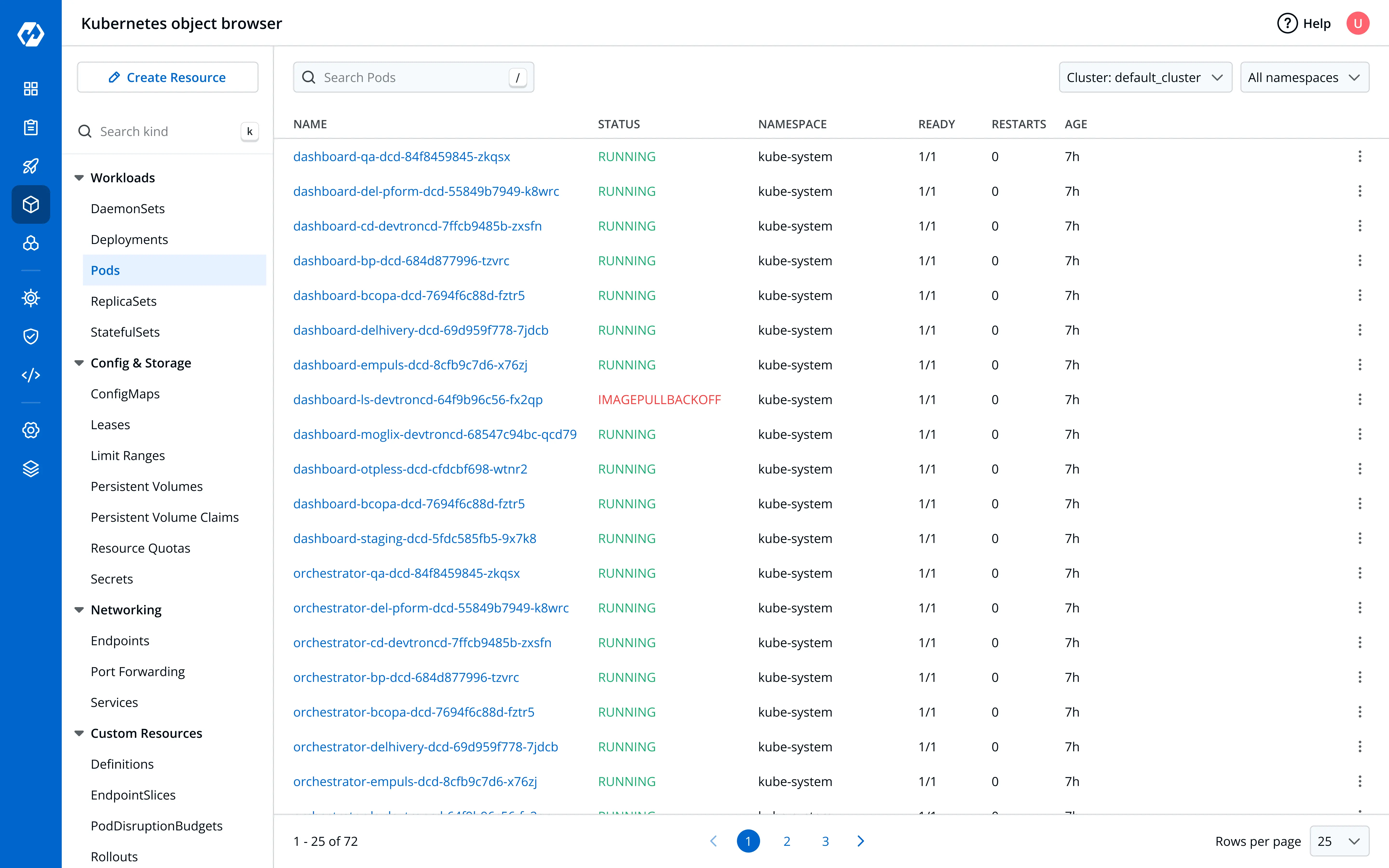
Grouped resource kinds and filterable list, the structure users are already familiar with
01
Resource kinds tree
Resource kinds grouped by cluster domains (Workloads, Config & Storage, Networking, etc.)
02
Search resource kind
Shortcut enabled resource kind search to quickly search a desired kind
03
Resource list
List for the selected resource kind with resource specific columns and a quick action kebab menu
04
Search Resource
Shortcut enabled resource search that allows searching across resource fields
05
Filtering
Cluster and cluster-dependent namespace filtering
06
Pagination Controls
Pagination controls to navigate through large resource lists
02.
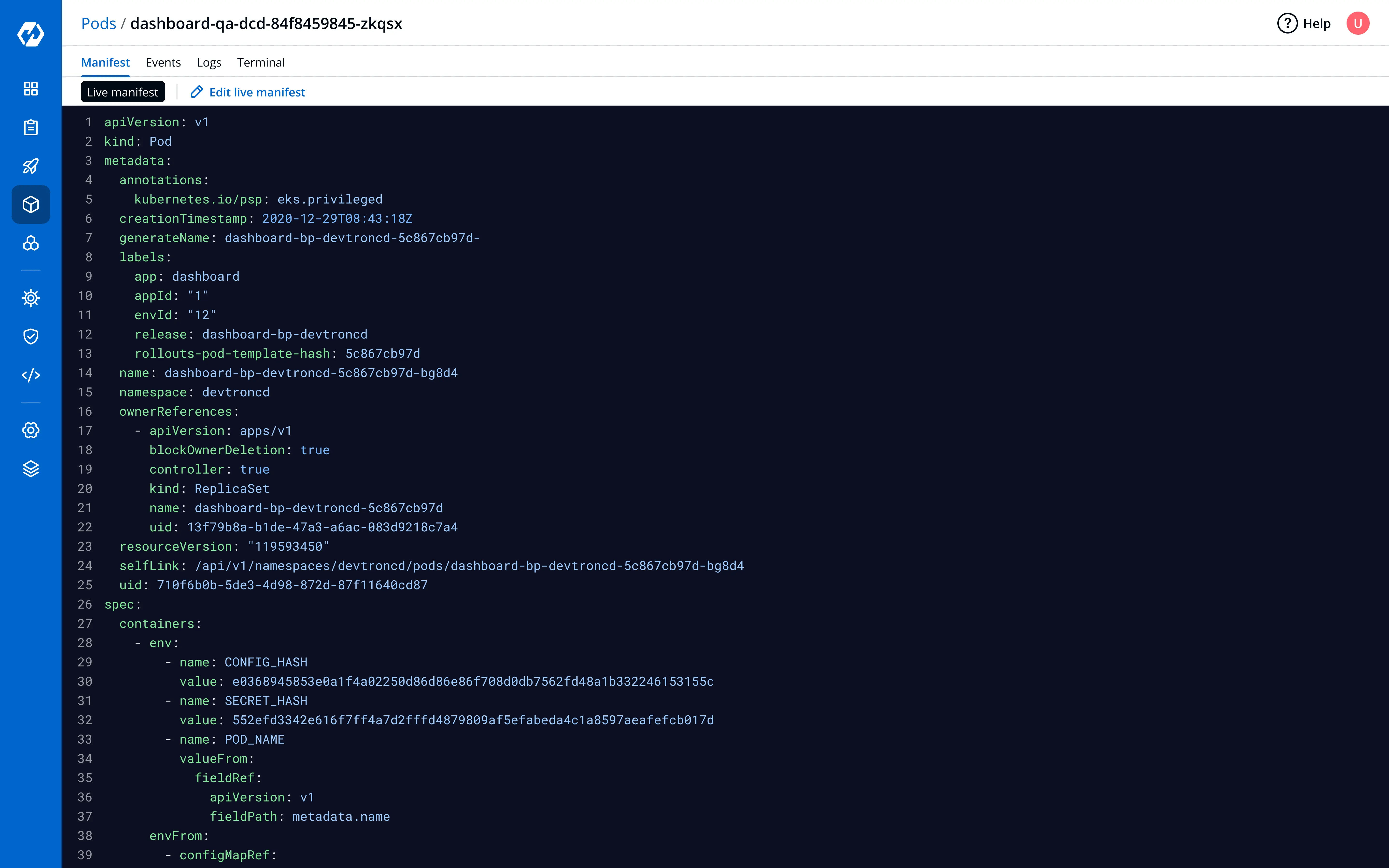
Resource Detail View
Dedicated resource detail view with resource information and tools to dig deep and debug
03.
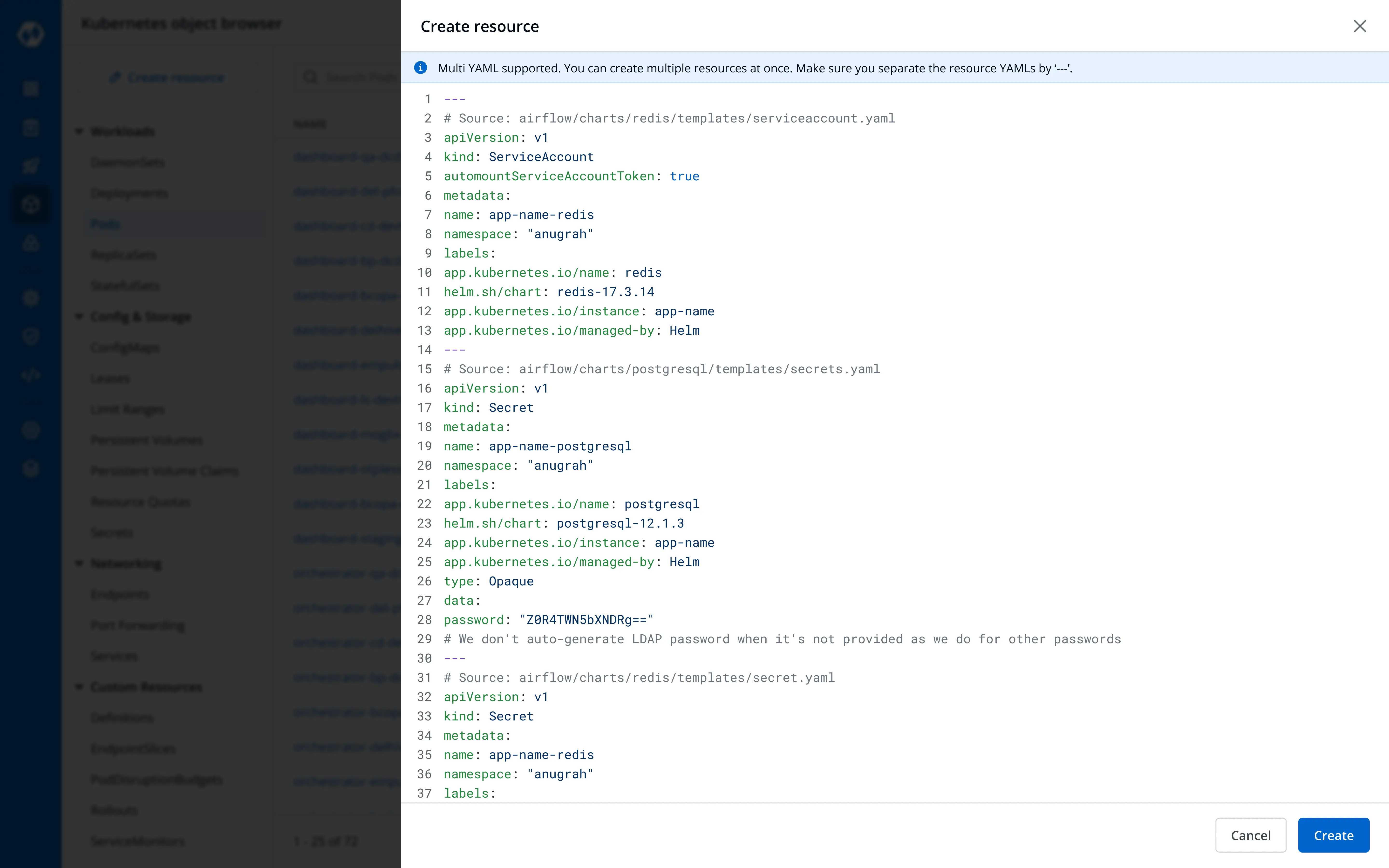
Create Resource
Apply a manifest directly to create multiple Kubernetes resources at once, directly from the dashboard
Feedback
Gathered from internal, enterprise and open-source users
| Category | Feedback | Why it mattered |
|---|---|---|
| Critical to workflow | Bulk actions: select multiple resources and act on all at once | One-by-one operations at scale were a bottleneck for users acting across multiple resources. |
| Critical to workflow | Auto-refresh resource state every few seconds | Inspecting issues requires the latest cluster state to avoid false diagnosis. |
| Critical to workflow | Cluster terminal accessible directly from within Devtron | Debugging still required an external terminal for anything the UI did not expose. |
| Slowing users down | Jumping between resources during critical debugging sessions reduces efficiency | Incident response meant constant switching between resources. Without it, users lost context and time on every navigation. |
| Slowing users down | Jump from App Detail to Resource Dashboard with context preserved | Enables users to quickly zoom out from an application to cluster-wide resource visibility, expanding the debugging scope. |
| Slowing users down | Searching and switching resource kinds is slow | Switching resource kinds is frequent during debugging. The MVP interaction hindered speed. |
A pattern in potential enterprise conversations kept surfacing: some users wanted cluster observability alone, with no inclination towards Devtron's CI/CD pipeline.
Post-MVP Updates
Feedback received from users was incorporated and shipped in a phased manner to deliver continuous improvements to the MVP
A desktop client with tab-based browsing
Distributed as a standalone desktop client in addition to the web-based version to cater to segments interested in cluster observability alone
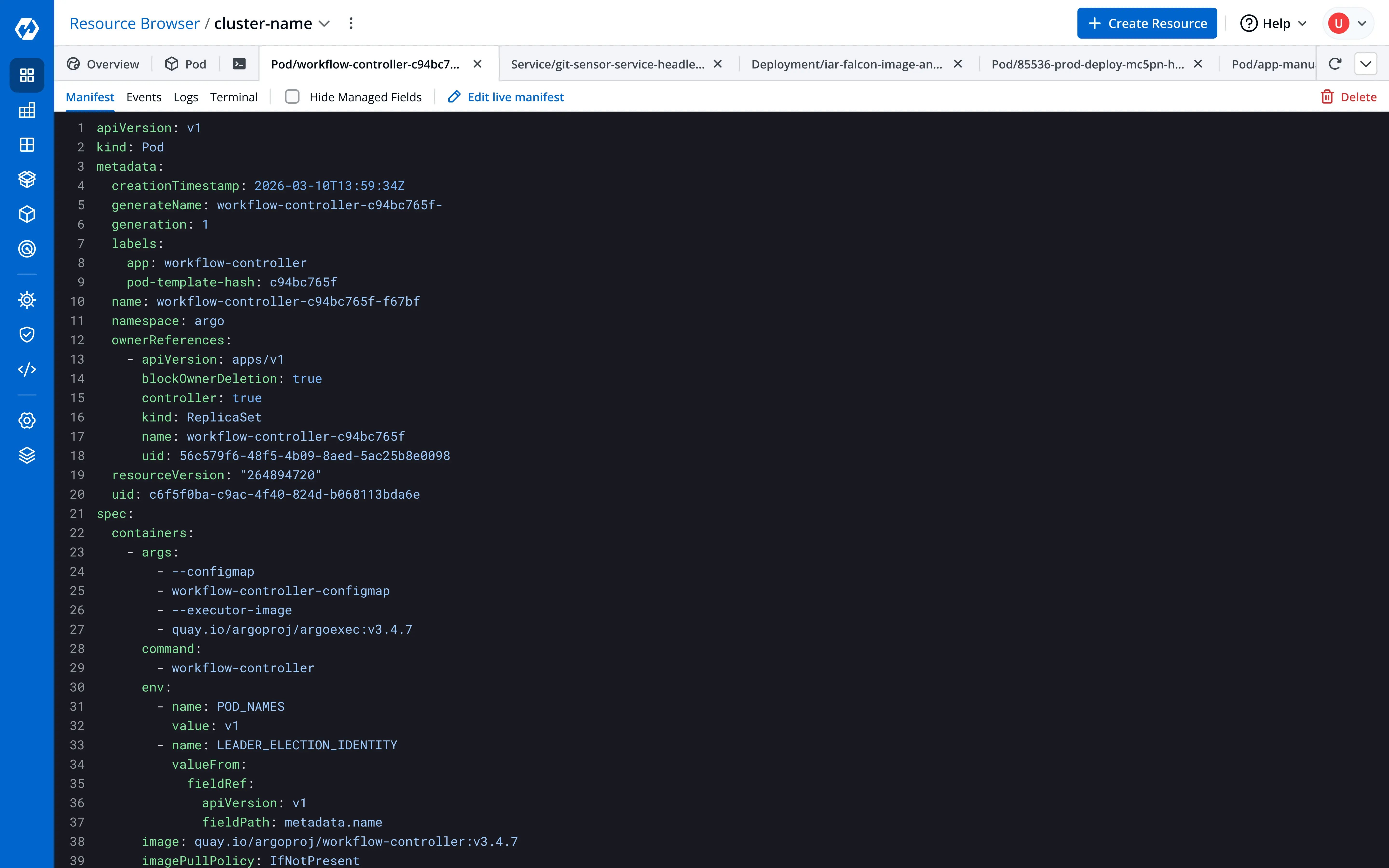
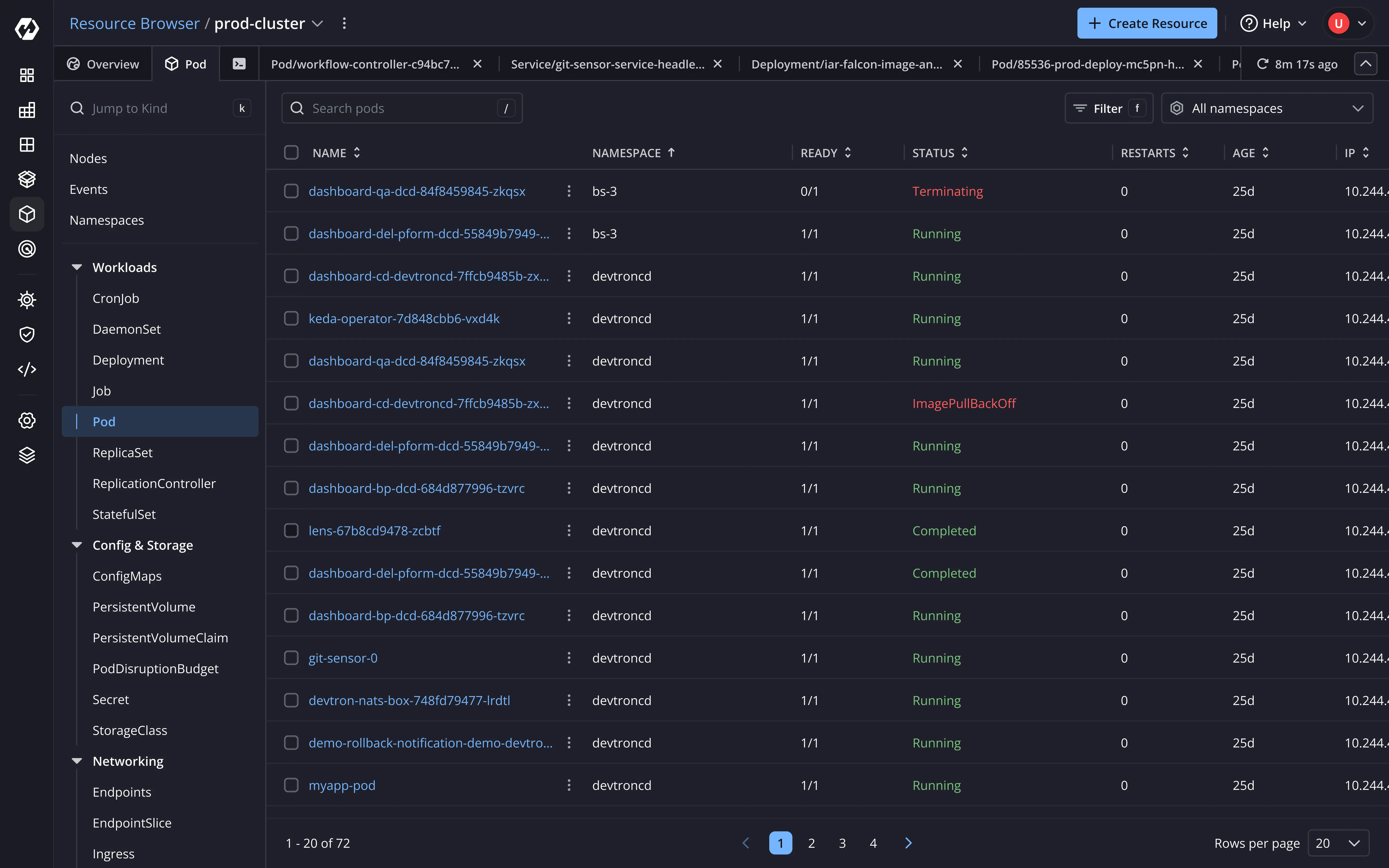
Multi-resource investigation: Resource detail opens in a tab, allowing users to quickly switch between resources
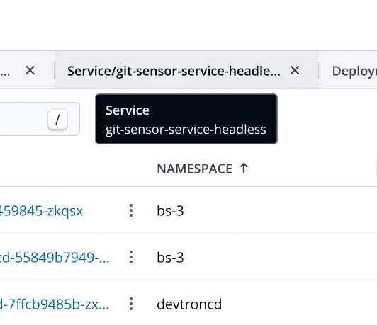
Interaction: Hovering over a tab shows resource kind and name for context
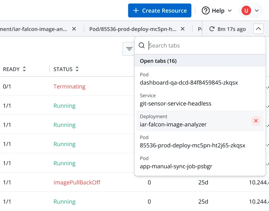
Tab management at scale: All open tabs appear in a dropdown allowing users to quickly search, close or switch tabs
Bulk resource actions
Select multiple resources of a kind and act on all of them in one operation

Resource kind switching interaction
Faster search and switching between resource kinds, with shorthand support for power users


Improved usability for searching and switching resource kind with Kubernetes defined shorthand support (Eg. Searching cm returns ConfigMap)
Terminal for deeper debugging
Ability to launch a terminal session on any node, for information or actions the UI doesn't expose yet
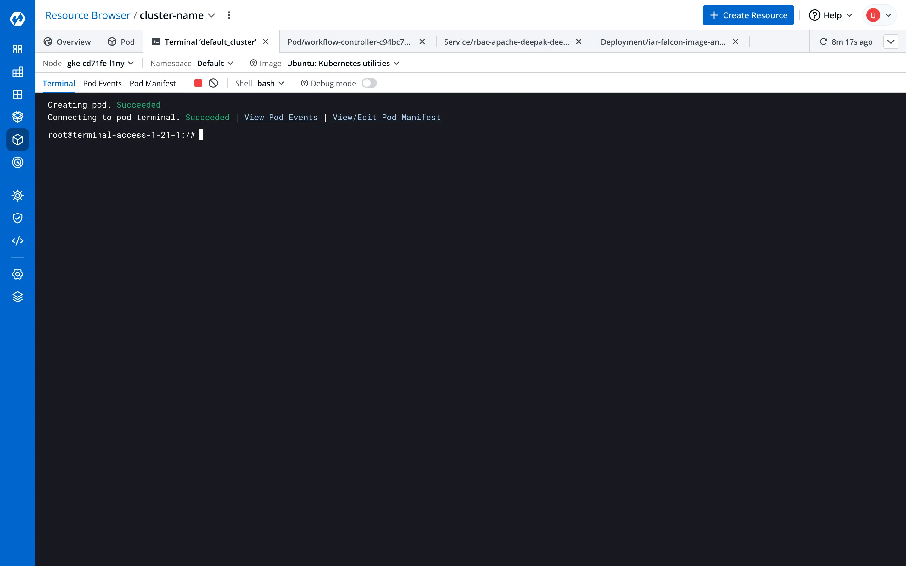
A live shell session launched inside the cluster node, no external terminal required
Quick link from App Detail with contextual filters
Jump from App Detail into the Resource Browser with cluster and namespace context already applied
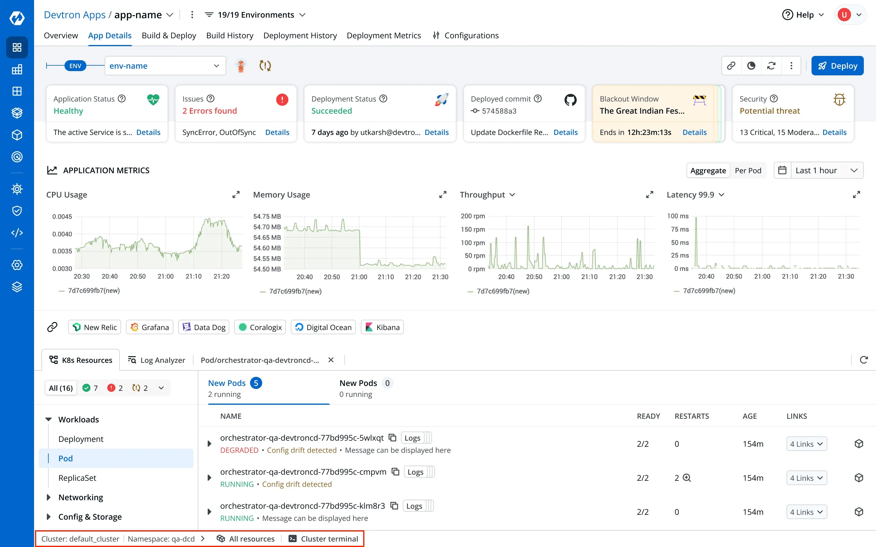
Shows cluster and namespace context in which the application is deployed. Actions serve as quick links to dig deeper.
Outcome
The internal team completely transitioned to the Resource Browser for routine tasks.
This was followed by strong adoption by existing enterprise users and interest by potential customers leading to deal conversions.
90%
Daily Active Usage across enterprise users after core updates were delivered
6 deals won
standalone enterprise deals closed for the Resource Browser alone
Reflection
Constraints force clarity
We had one week to design and ship the MVP, which left me about two days to finalize scope and hand over the fundamental designs. The aggressive timeline taught me to take hard decisions quickly: what to build now, and how to set the base for updates to come later.
The details build the experience
Do not change something for the sake of change. If it works well with no obvious drawbacks, adopt it and build on top of it. Set a stable base, then craft the minor details that lift the experience. They compound, and eventually result in a differentiating and delightful product.